Wireframes for the FDMS.gov site. These were developed after conducting direct user research to discover pain points and desires from the users for the next iteration of the platform. The design was developed to re-organize the content to be task driven and easier to process the more complex forms.
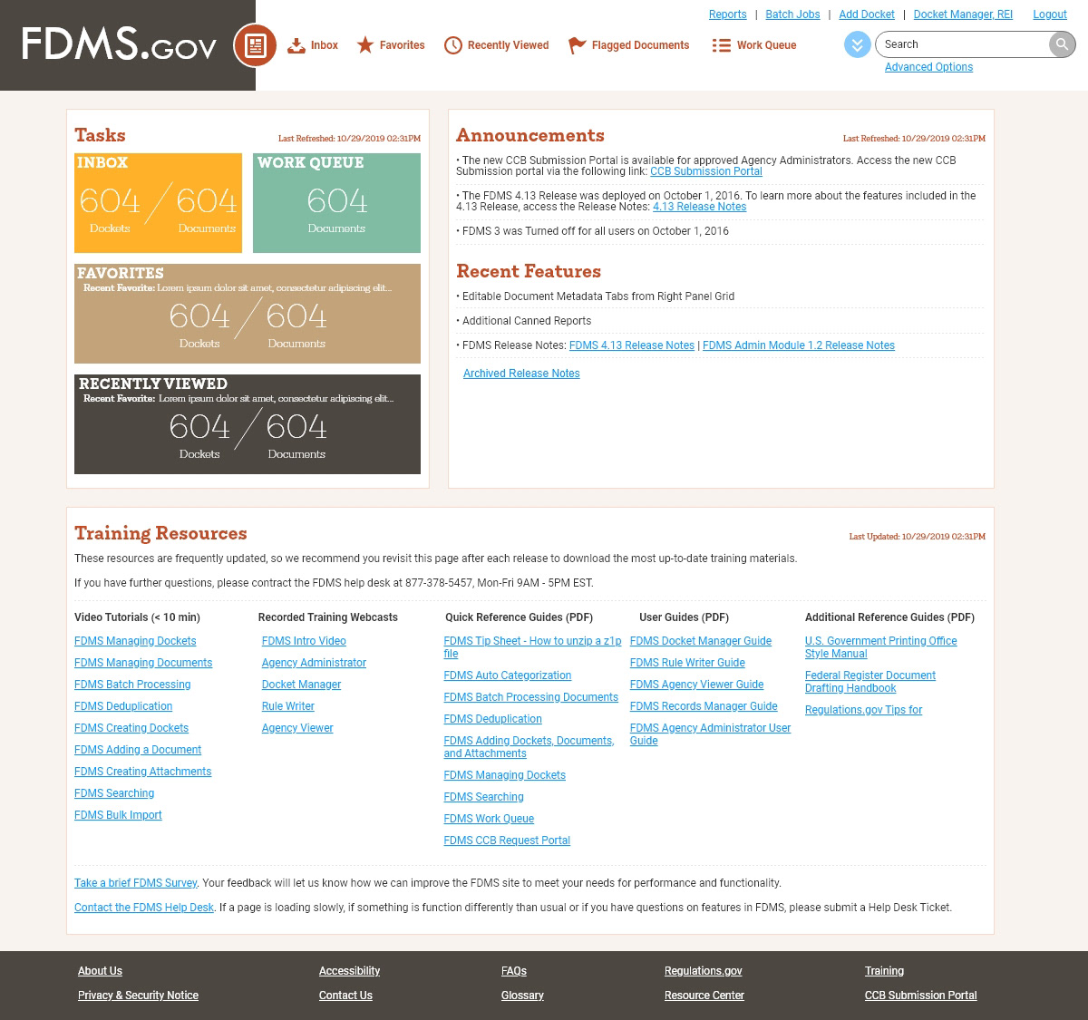
The homepage is set to function like a mini-dashboard informing the user of current task related factors, announcements or added features that might impact their daily tasks, and static training elements readily available for new users or seasoned users to access. The layout has been updated for a more modern approach and updated color scheme.
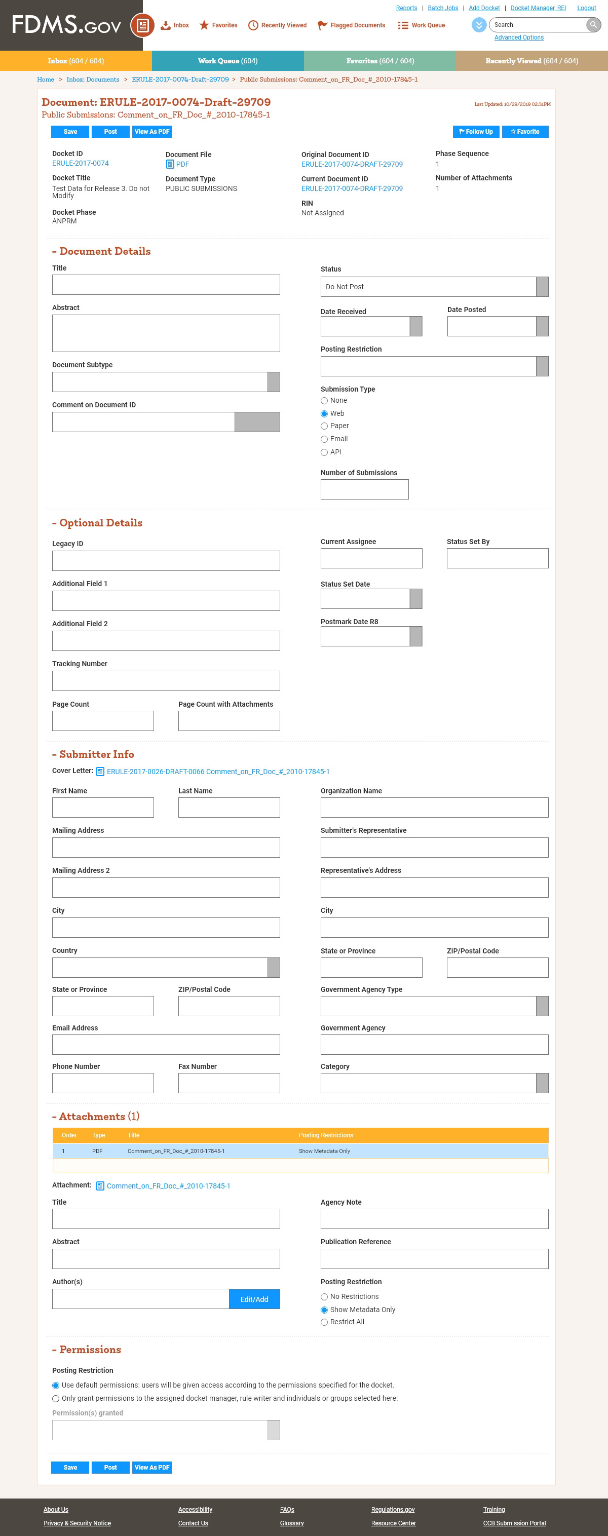
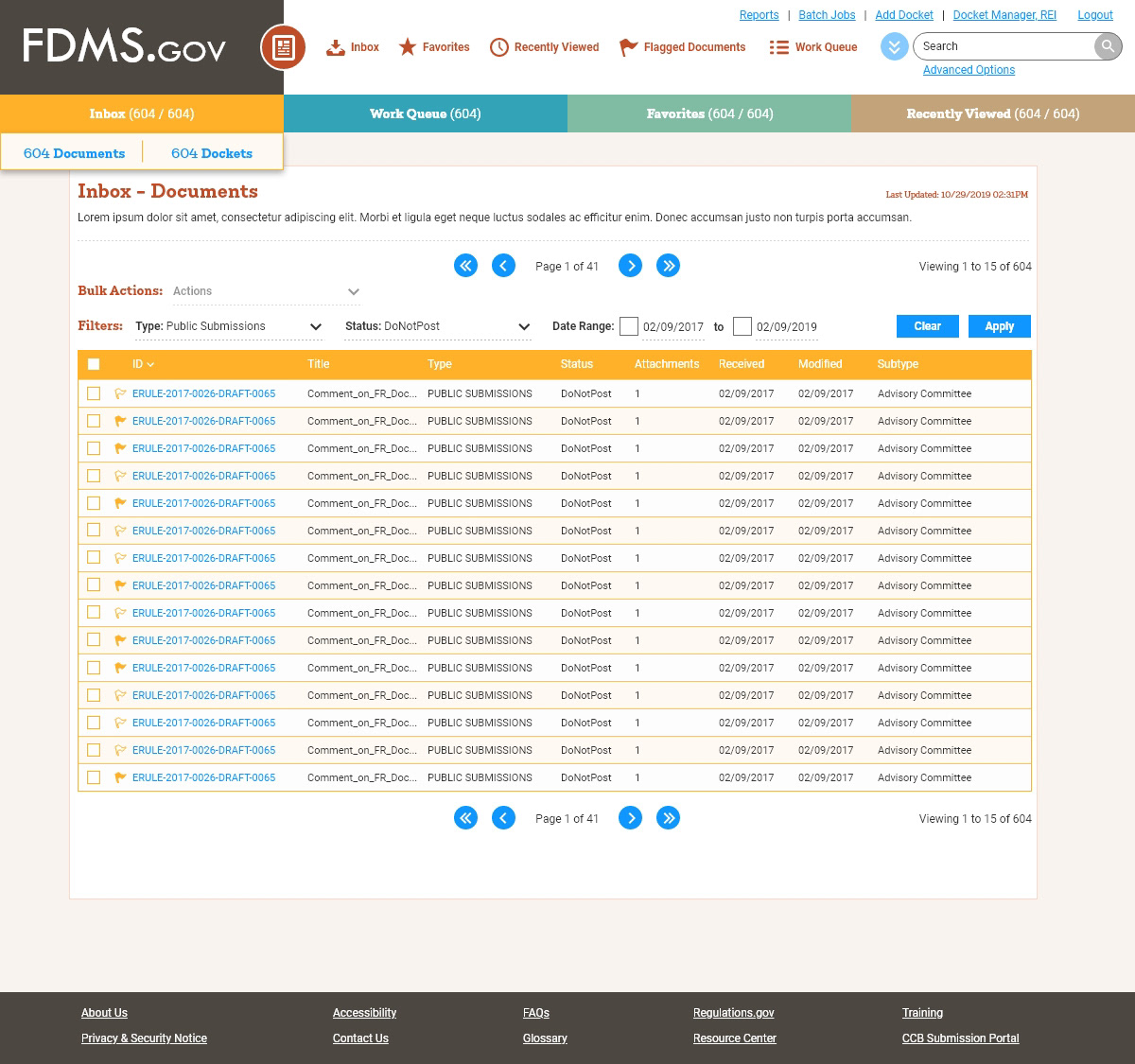
Given the complexity of many pages, the ability to filter and sort large tables is paramount to finding relevant items. Hover state is also shown on the "Inbox" navigation item to allow users to navigate directly to 'document' or 'docket' views.
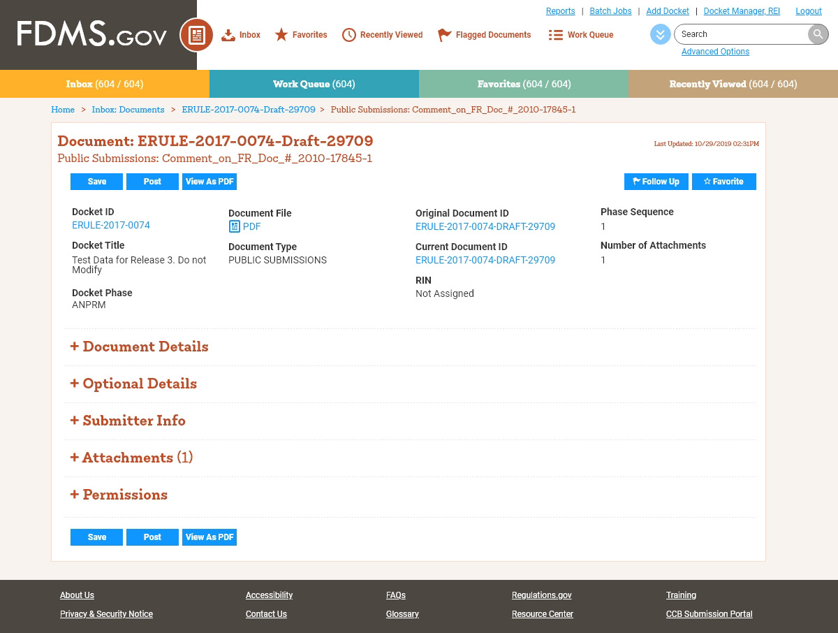
Upon finding an item to work on, users are kept informed of the relationship of this item to its parent items. A 'scorecard' method keeps all static data points at the top of the page to help maintain context. The fields that can be manipulated by the user are placed in a long-form accordion format.
When fully expanded, each section is assembled with associated fields in a two column format. The inputs are set with label above the field input for easier readability given how many fields are in one form. Controls are placed at the bottom of the form as well as the top for user convenience upon completion.