At the client's request, we as a team were instructed to re-evaluate the design and experience of the Electronic Handbook system. The primary concern was the Review and Selection (RevSel) process. This process involved subject matter experts (SMEs) logging into the site to review applications and select them for further analysis.
The team was given 5 days to capture the users' pain points, develop a solution, and present to the user group and interested parties.
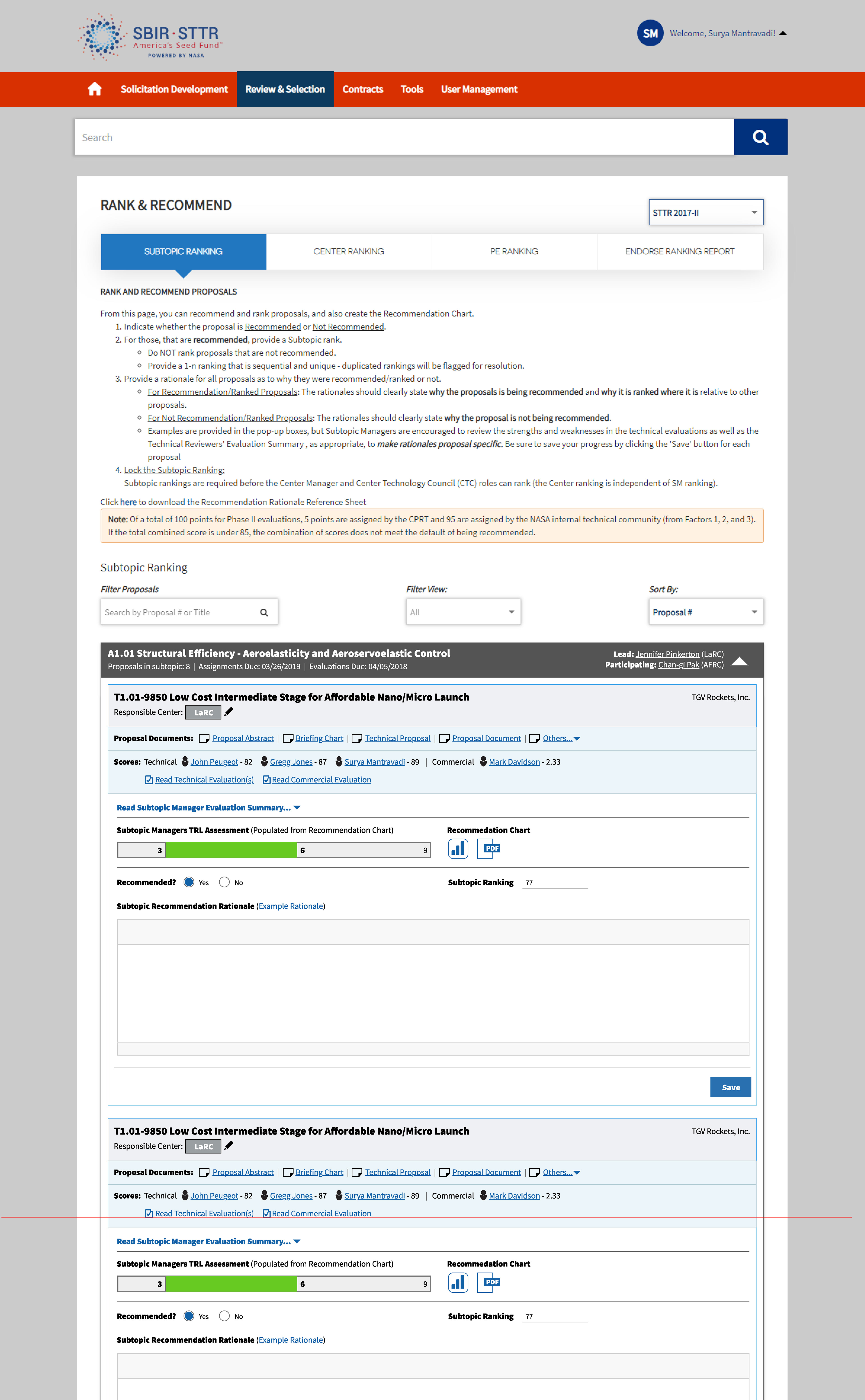
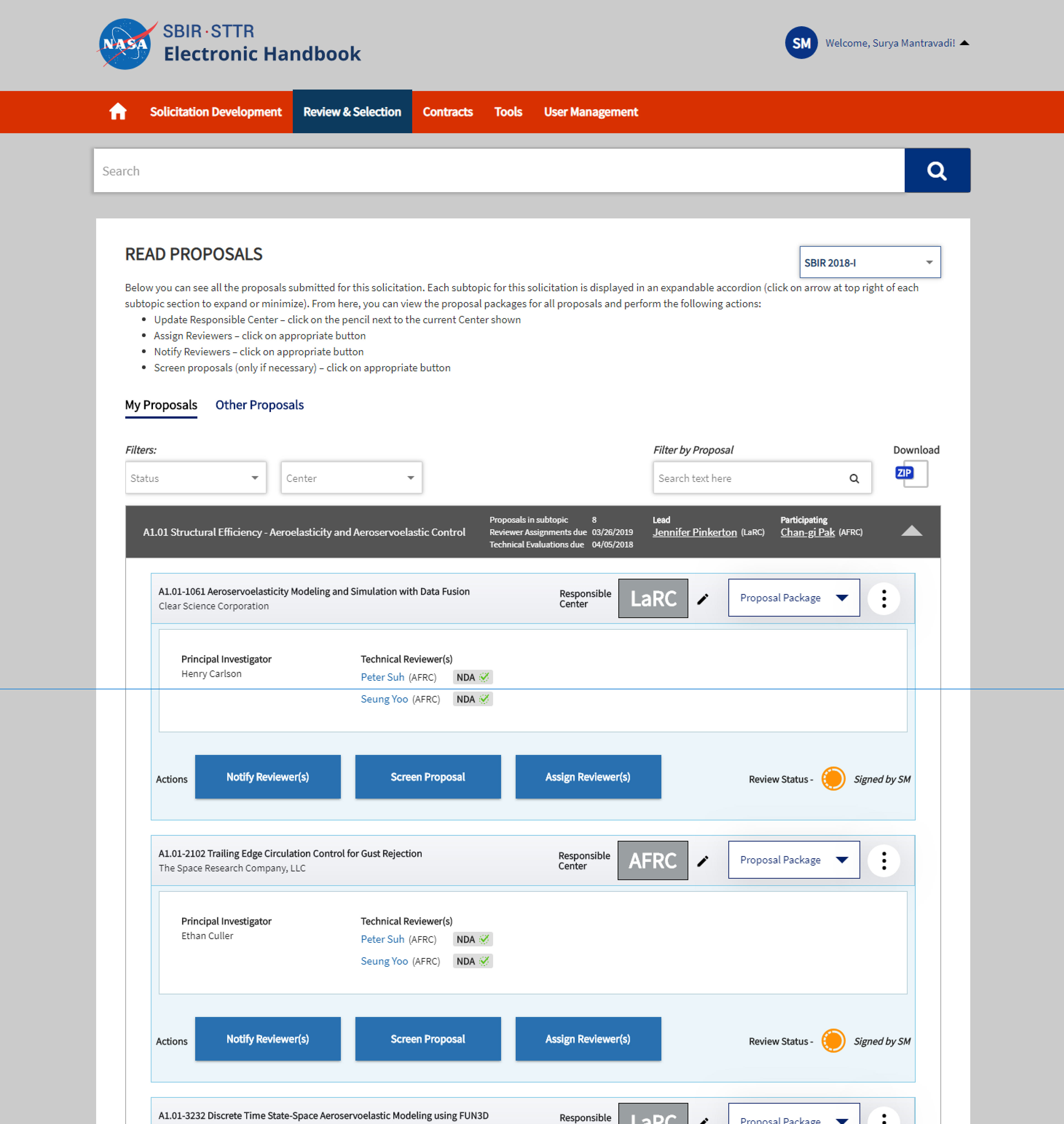
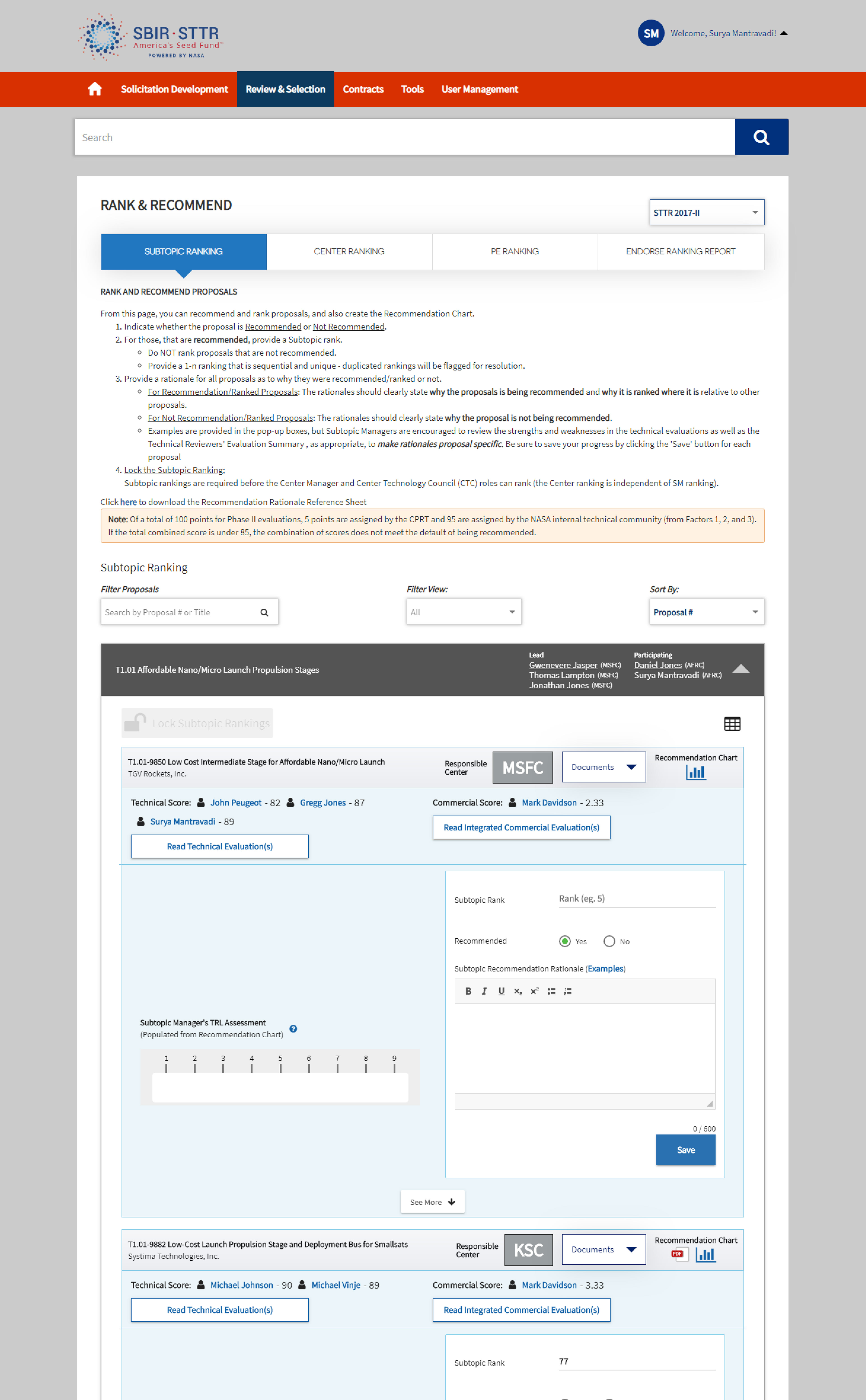
The main pain points of the user group included not knowing where information was, an absence of information, clunky workflows, poor navigation structure, and not being able to quickly complete any tasks in the system.
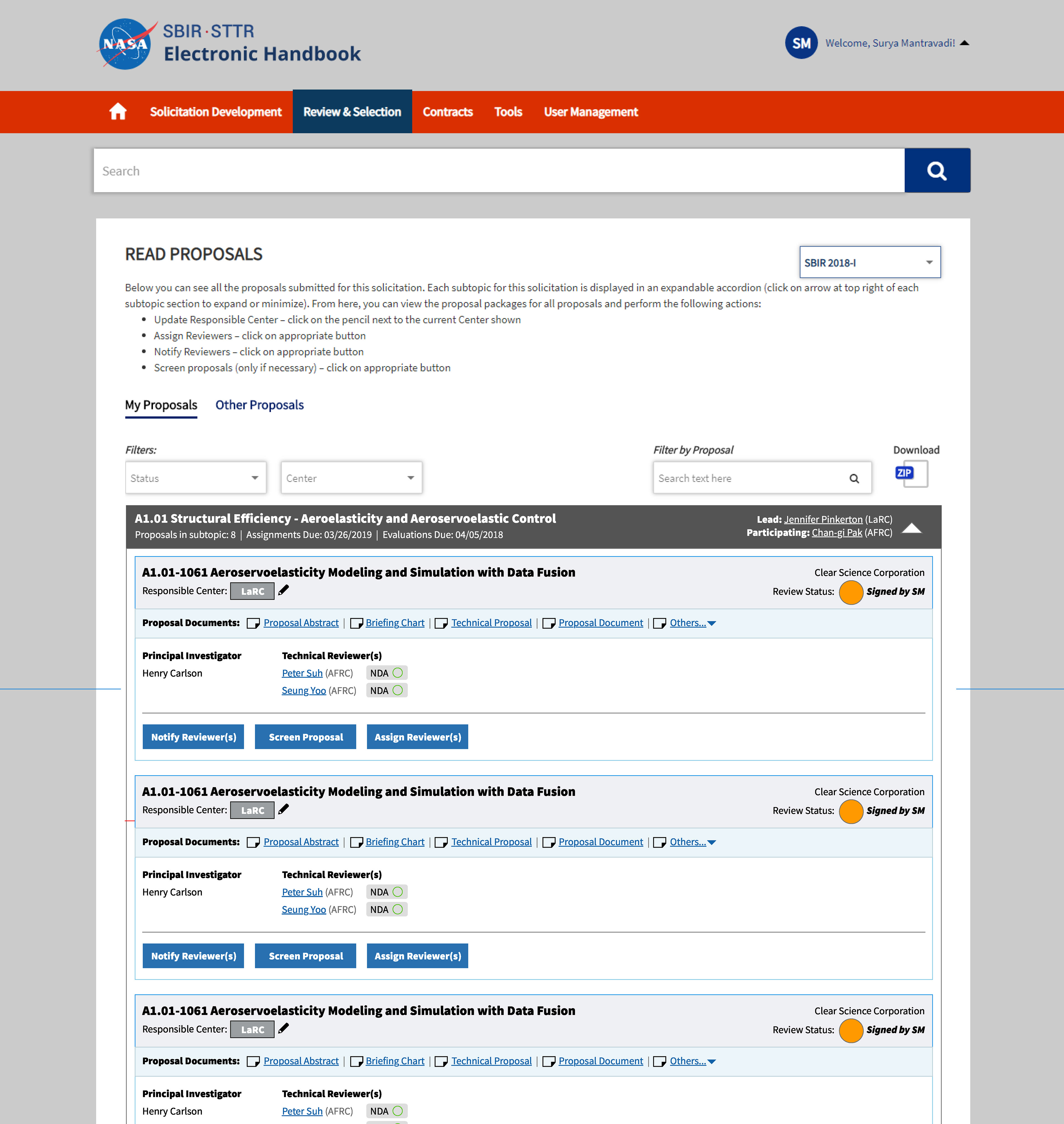
One of the challenges of this project was all existing functionality needed to still be present in the final. With that in mind, much of the information required re-organizing to pair together 'like' data-points. The solution developed involved a restructuring of the information hierarchy to allow users to quickly assess section titles, current statuses, and available links and controls. Typographic elements and color coded sections help to direct the user to the most relevant information in their workflow. The flow of the page was set to be easier to consume while still leaving access to the controls and document downloads.
While the system still maintained a high level of complexity, the users were pleased with the new flow, and found it much easier to log into the system, find their tasks, and accomplish them in less time.
Before
After
Before
After