Bringing Consistency and Unifying Interfaces Across Applications
As part of our contract with the FDA, we were charged with the maintenance and development of a platform of applications. Each application was created at a separate time, by managed by different stakeholders, and often by different development teams. This resulted in many of the applications having widely different user interfaces, patterns, and aesthetics.
The Challenge
Create a design system that could be utilized across many applications that reflected FDA's branding guidelines, adhered to federal regulations, and could be scalable for future development. The system must be flexible enough to work for custom coded Angular JS solutions and low-code Appian platforms.
Key Objectives
Create the design system for the FDA SCAIL platform.
Document the standards and conventions for both coding platforms (custom and low-code).
Utilize the design system to accelerate the design and development time.
Design Process
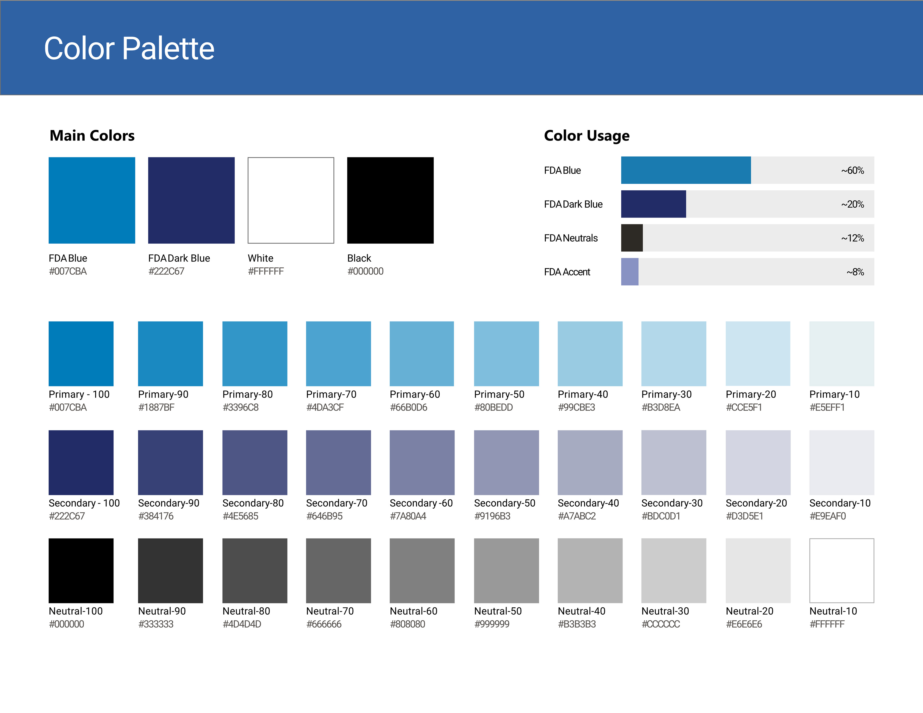
The development of the design system required research and knowledge into multiple sources in order to develop the system that could accommodate the requirements. We were able to utilize the United States Web Design System (USWDS) to develop a foundation and Digital.gov for additional guidance on accessibility to be aware of. The FDA branding was then overlaid on to our foundation and then further customized for added aesthetics.
The environment in which it is used has many factors to take into account, such as the code base, age of the application, and level of effort to update it to a new design. The design language would need to be flexible and clean in order to allow multiple applications with sometimes very different purposes to use it.
Key Features
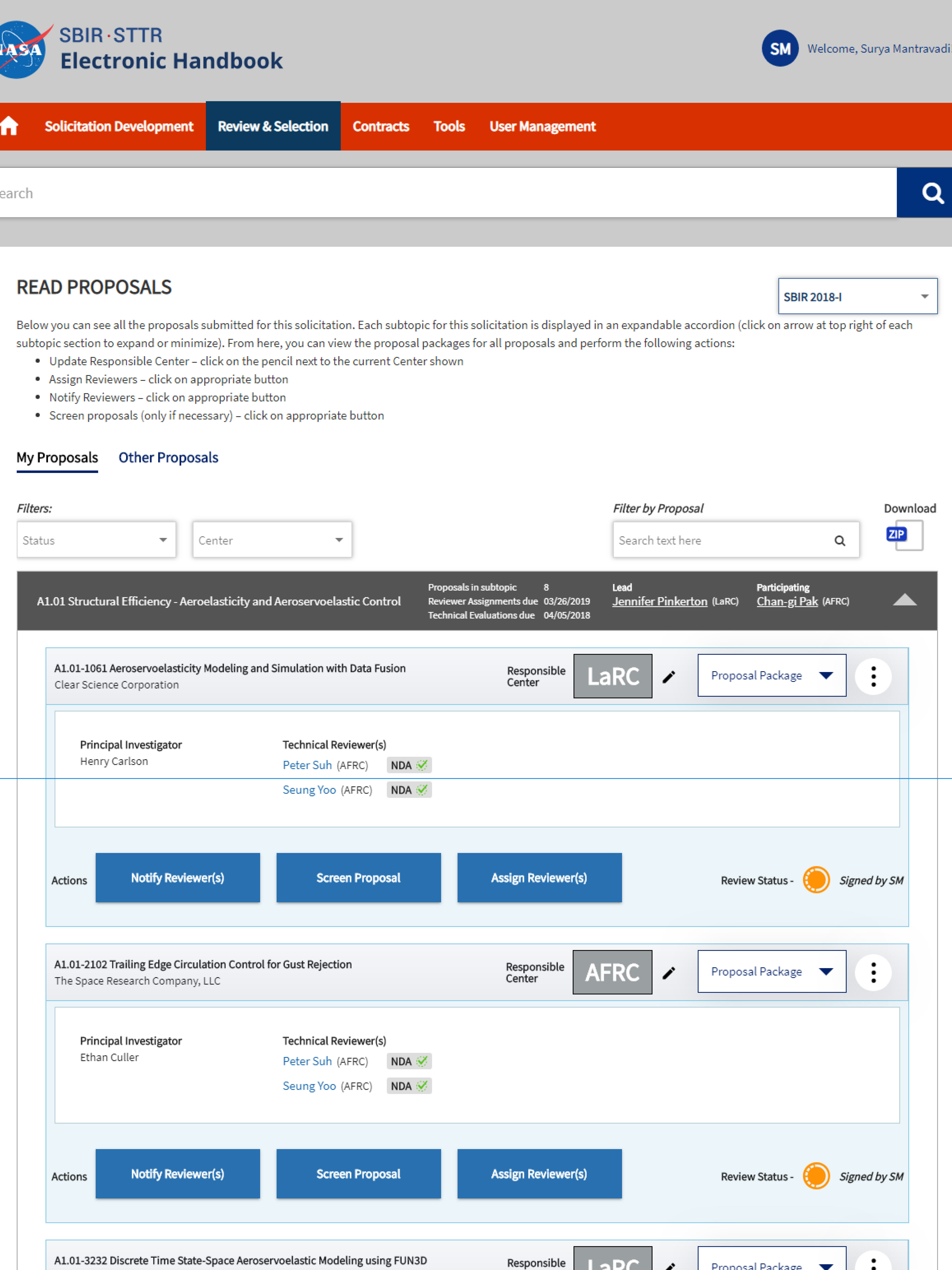
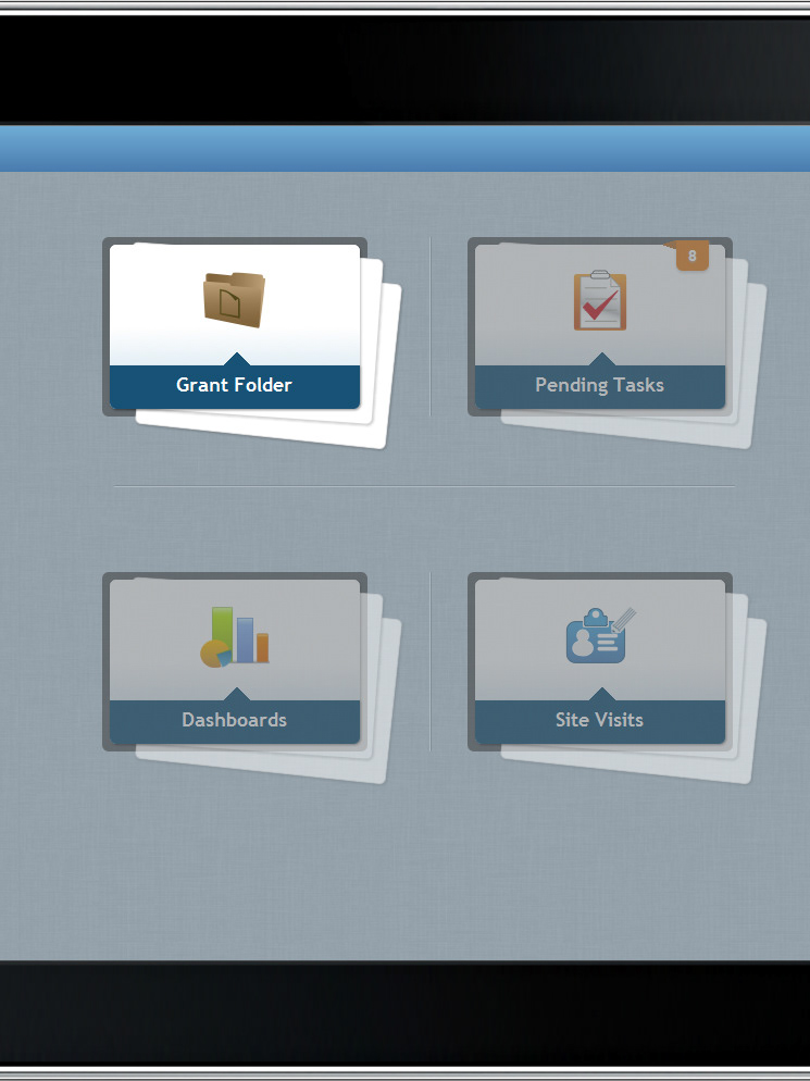
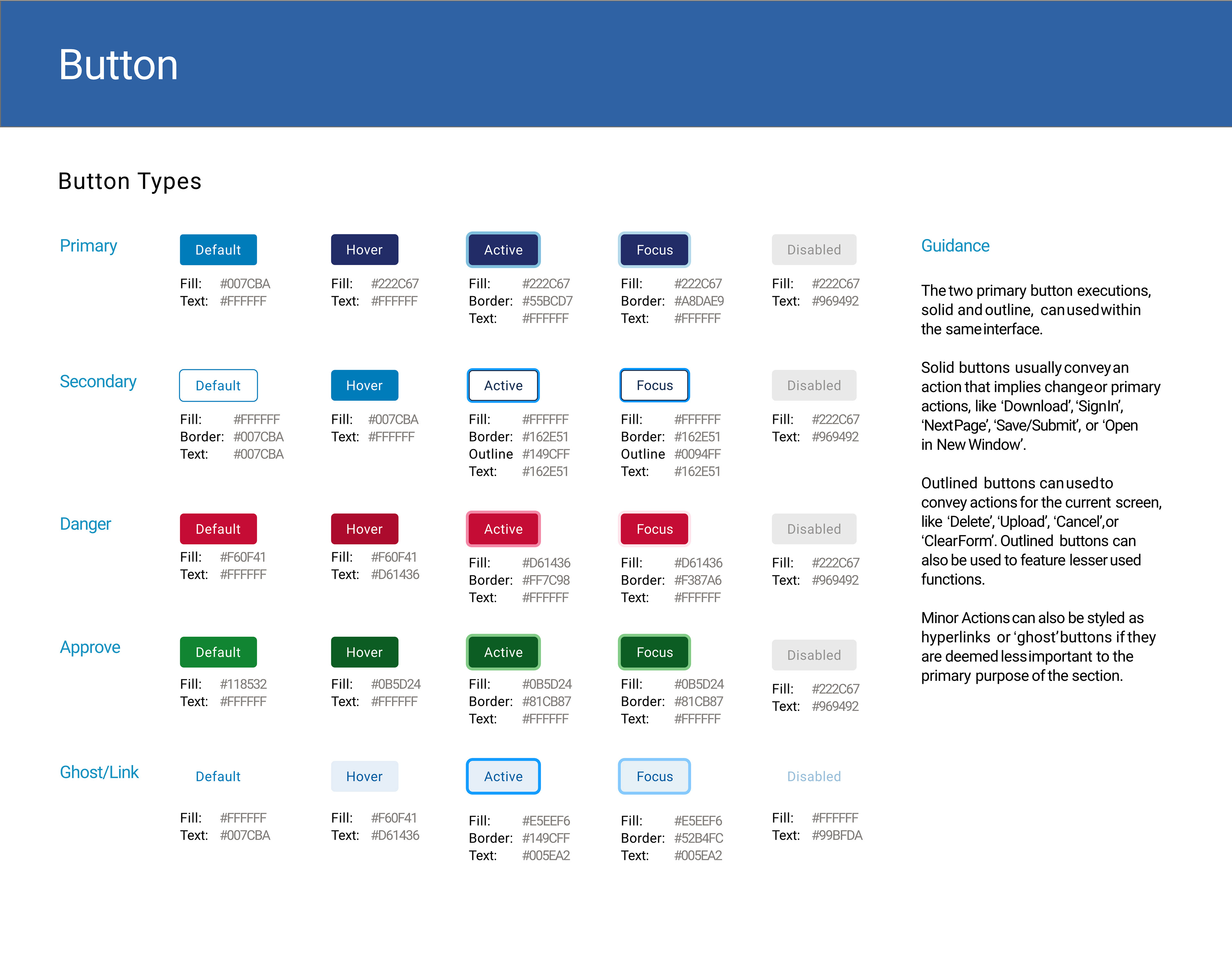
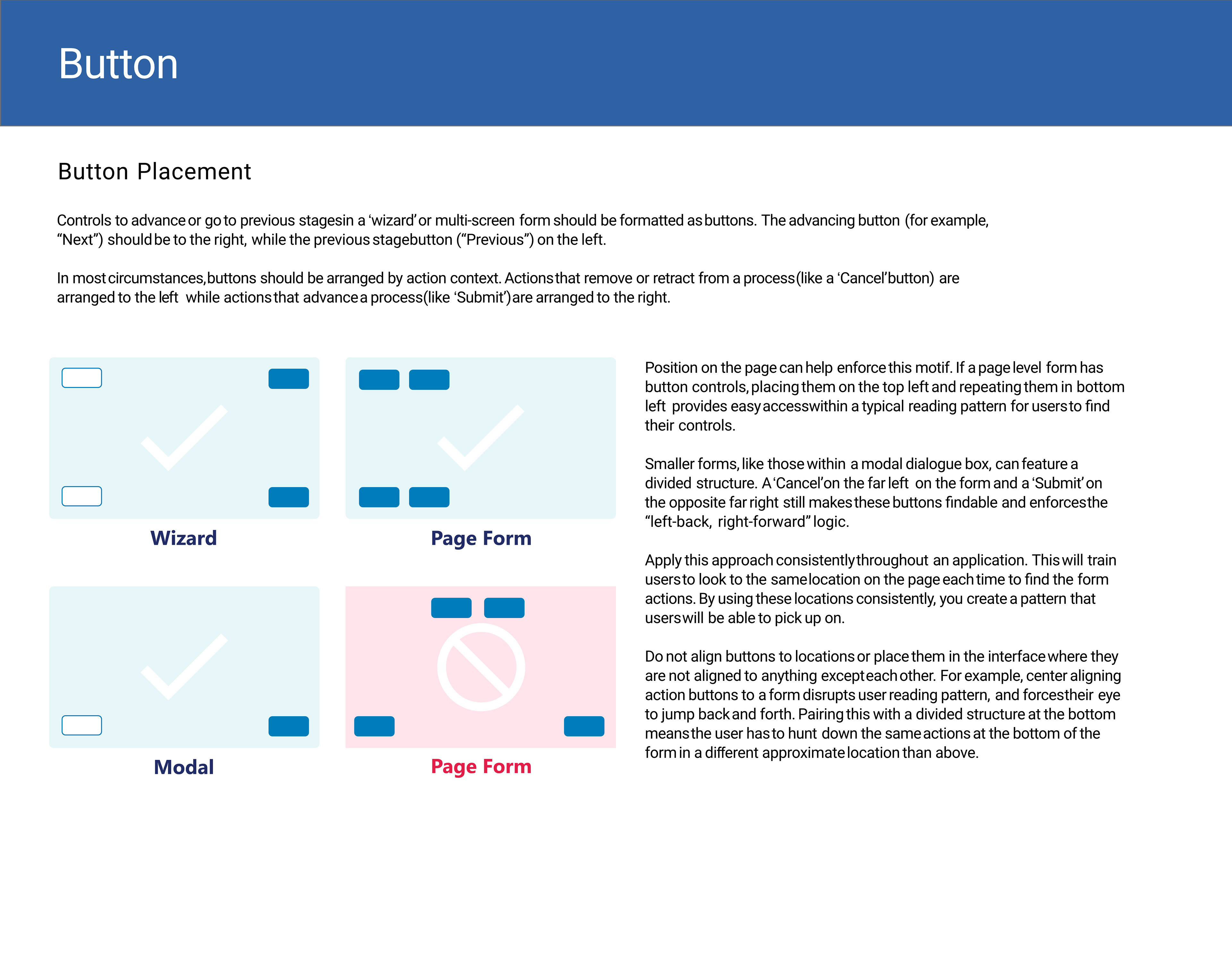
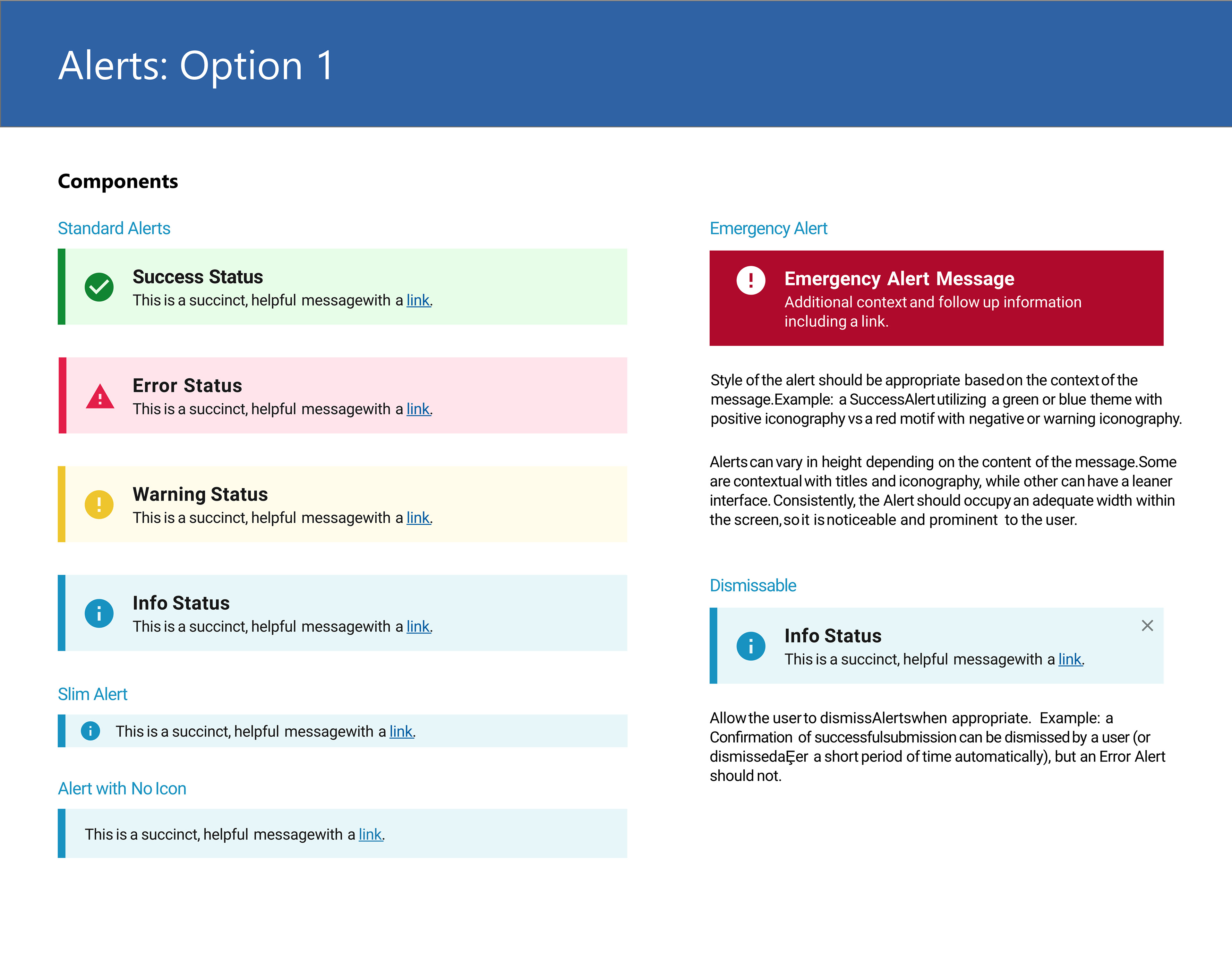
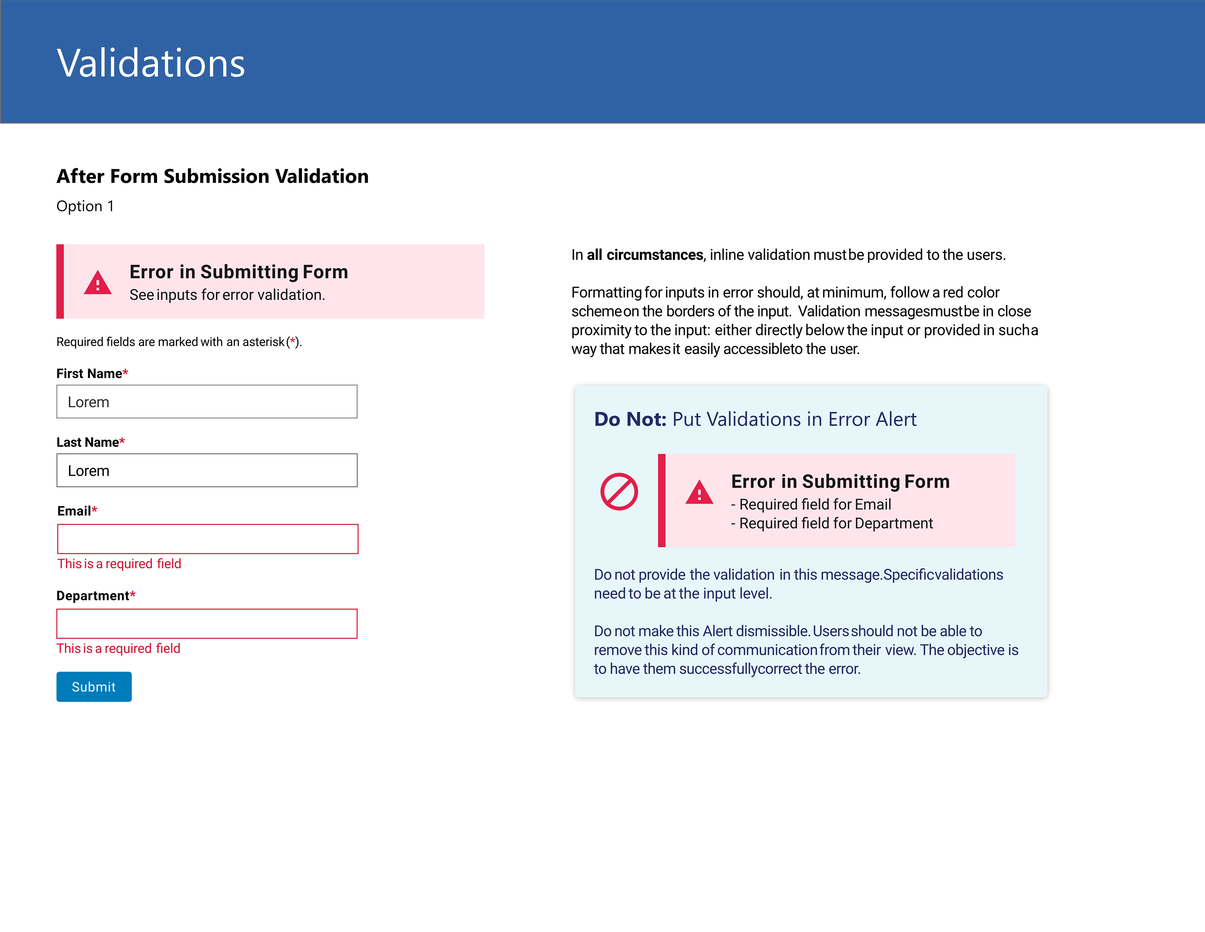
The coded version of the design system leveraged Angular Materials Design as its UI kit. Materials Design was already being utilized by some of the more modern applications and any further modernizations would likely use the same. I developed a coded style guide using Angular Materials that could be leveraged in custom coded solutions.
This guide separated out each element into a separate component as well as having the theme of the guide as a feature that could be used independently. Building it this way would allow existing applications to update their UI one component at a time instead of all at once. This makes the effort to modernize significantly less daunting for older applications.
Documentation for the system laid out usage and rationale for specific patterns and standards. The details on some patterns are extensive due to the complex nature of some interactions. This was also a measure to ensure no open interpretations would develop over time or come to pass due to lack of instruction.
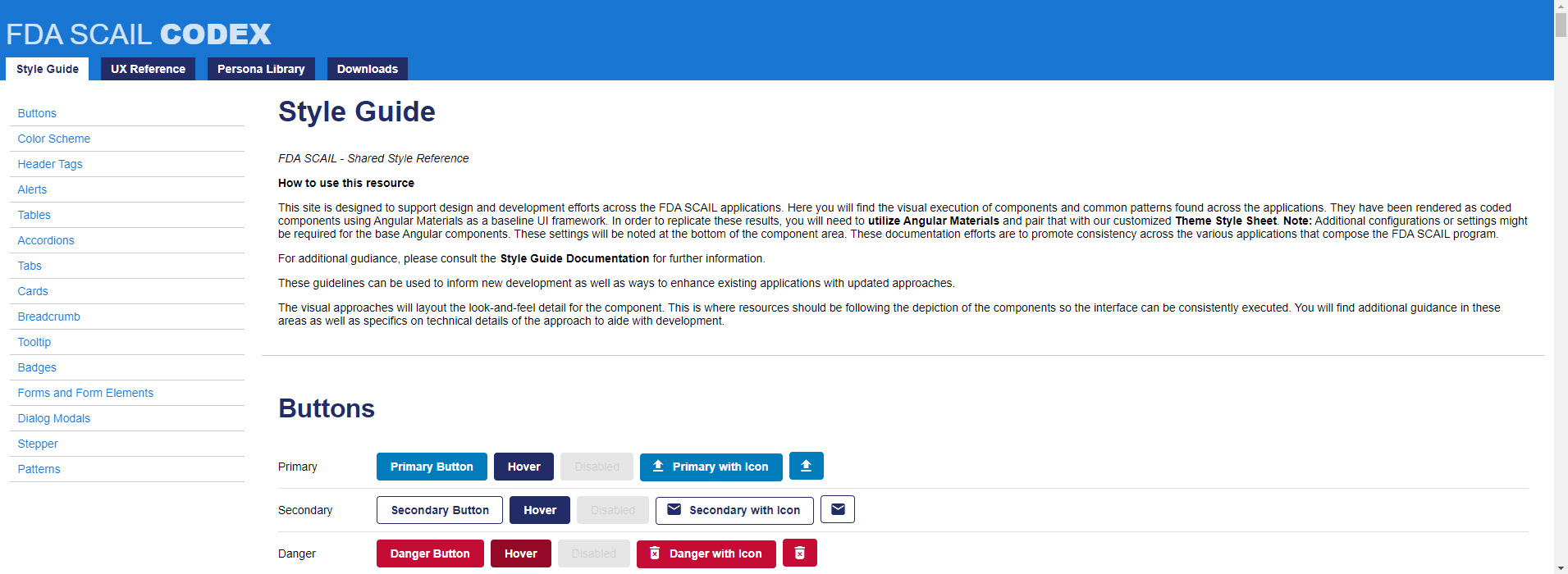
Screenshot of the coded Style Guide. Built on Angular Materials Design, it features fully coded components that can be reused to accelerate front-end development.